
Reference
Availability Timeline
How to create an availability timeline chart in a Bloo workbook.
Updated 2026-08-17
Availability Timeline
This chart displays the availability of signals over time, i.e. the duration for which the particular signals were in an active mode. You will have to group your data and the query should include the first seen and last seen details to form the chart.
Creating an availability timeline chart
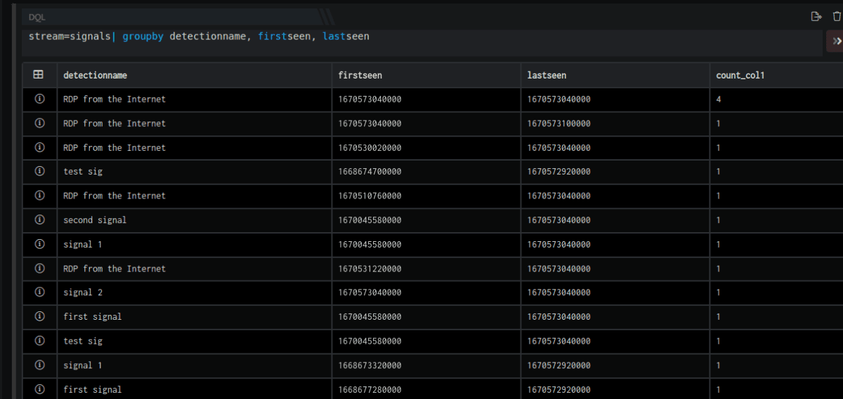
- Go to workbooks, add a DQL block and enter a query. Ensure the stream is signals and first seen and last seen parameters are added to the query.
For Example:
stream=signals| groupby detectionname, firstseen, lastseen- The
stream=signalsdirective will retrieve all fields for each event where Stream is Signals. The result set is grouped by unique values ofdetectionname,firstseenandlastseen. The result set is sorted in the descending order ofcount_unique(by default). The query results will be displayed as follows.
- Now add a visual block, and enter the following details in the field provided.

| Field | Description |
|---|---|
| Name | Enter a name for this particular widget/chart that you are creating |
| Type | Select timebar from the drop-down |
| Primary | Select the primary value for the chart to be created |
| Secondary | Selected the secondary value for the chart to be created. Note: You can add multiple secondary values as per requirement. In this query firstseen, lastseen and count are secondary values. |
- The availability time chart is displayed
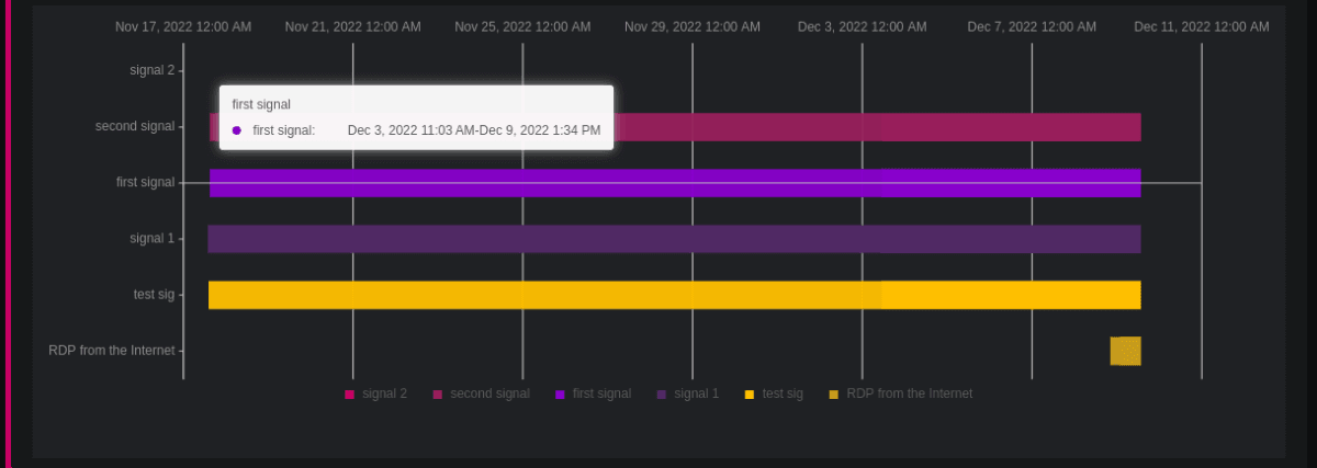
- Hover on the bar to view the exact duration.
Related
Was this page helpful?